Cherry Hill Kitchen + Nursery Remodel | South Jersey
Simplicity and function in Cherry Hill
Photography: Plate 3
The kitchen is no longer a room known only for domesticity or culinary creativity; it is a dynamic space built around communality as much as it is built around food—the new heart of a household.
-
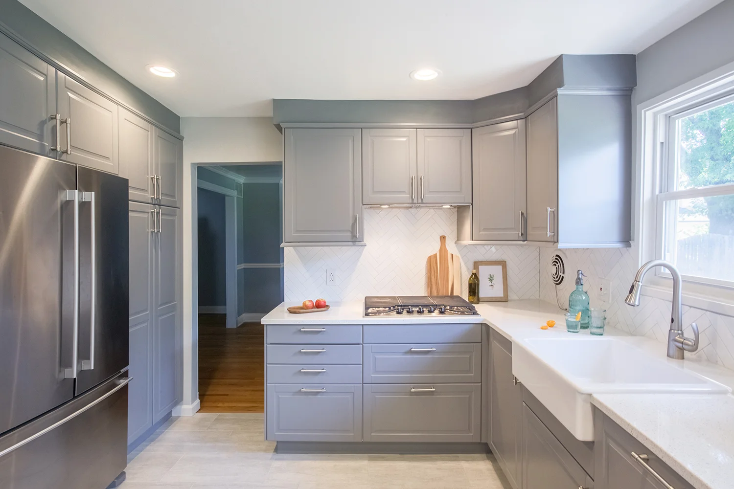
When the owners of Cherry Hill bought their home, they knew that the uncomfortable layout and general outdatedness of the kitchen would require thoughtful reconsideration. Now elevated to the status of “modern kitchen,” the new space evokes streamlined simplicity through a bright achromatic palette, increased countertop space, and an effective new layout.
Working with Shila during the planning phase for my kitchen was invaluable. Her ideas allowed us to expand our vision for the room into the adjacent den to allow for a breakfast noon. She helped me work out many functional details that I would not have thought about prior. Many believe that you hire a designer to make a space "look" better but if you're working with a qualified designer like Shila you will learn quickly that she provides much more than that!
- Carla, Homeowner
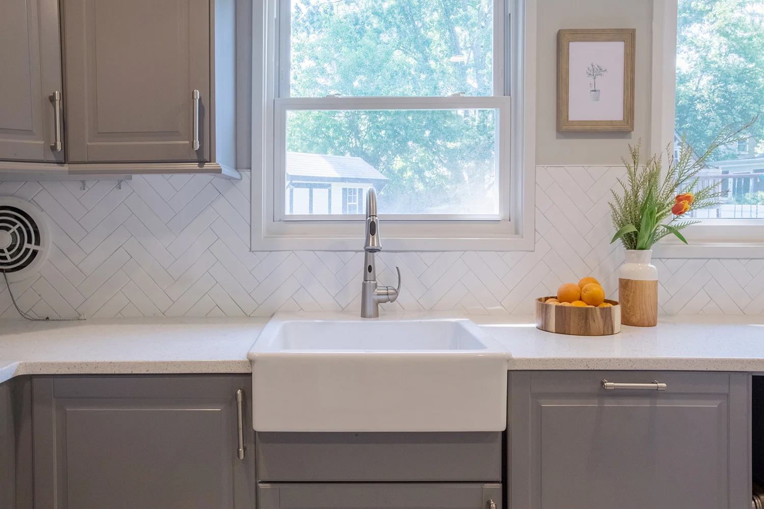
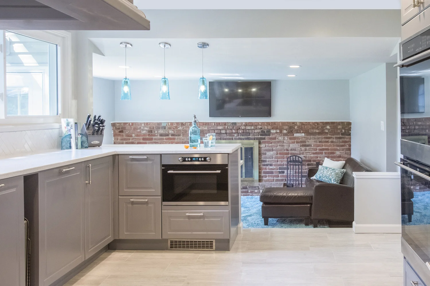
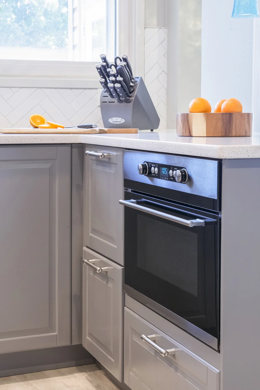
A blend of preference and functionality, the design integrates personal priorities—double-oven, hidden microwave, accessible cabinetry—with a modern aesthetic suited to the clients. Generous light is brought in through double windows, while the quartz countertops, farmhouse basin, and herringbone subways tiles continue in pale tones brightening the space. Recessed lighting takes the place of a mounted fan fixture rounding out the general openness of the plan.
Continuing in open concept, a breakfast bar situates itself at the threshold of the kitchen and sunken den, putting the two rooms in conversation. Subtle moments of teal create further cohesion between the two domains, and throughout the home. Overall, the kitchen hones a feel of hospitable elegance, inviting as it is striking.
Cherry Hill Nursery
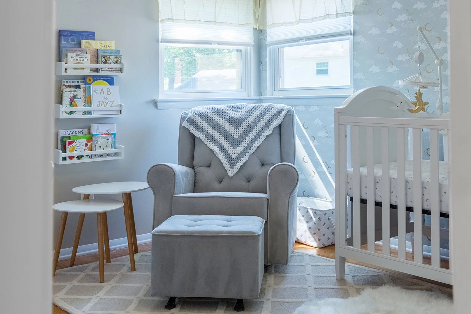
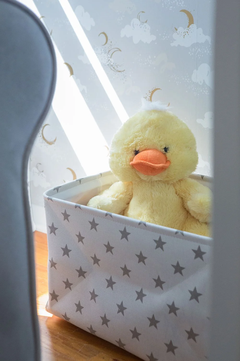
As the owners of Cherry Hill prepared to welcome their first child, their world was full of mystery, especially given that they chose to keep the gender a surprise. In a move to convert the guest room into a nursery, the design favors warm, neutral hues of grays and yellows to suit either boy or girl. From these colors sprang a clear celestial theme of moon and stars.
-
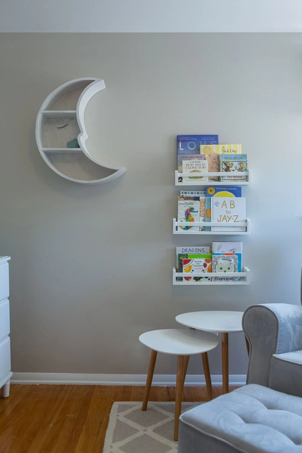
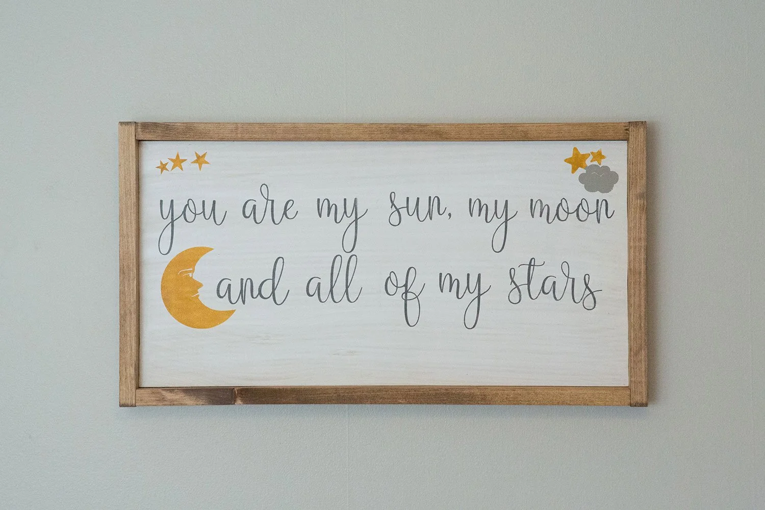
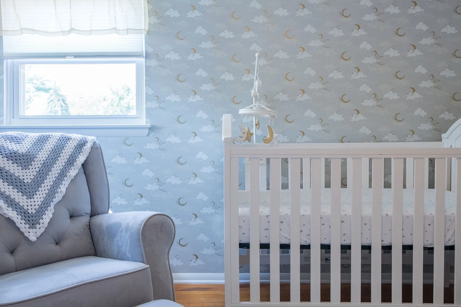
The inspiration comes through boldly in the wallpaper which lines the crib’s wall. The remaining walls were painted in a matching soft gray with non-VOC paint to ensure safety for the mother during the renovations. Playing further on the wallpaper’s skyscape hangs a mobile of golden stars and moons, a crescent-shaped shelf, and tender lunar art pieces. Nestled between two sun-producing windows sits a gray and white glider within arm’s reach of outward-facing bookshelves.
Overall, the nursery hones a simplicity and timeless akin to its celestial theme. The design captures the affection and wholesomeness that comes with starting a family, offering a peaceful place for the family to begin and grow.

